The Precursors
When I first built out my personal website during my undergrad in January 2018, I took the course most students in tech take and used a free template from HTML5 UP. Specifically, I used the Dimension template and it was great. It served its purpose for an undergrad student with limited experience with HTML/CSS that was looking for internships.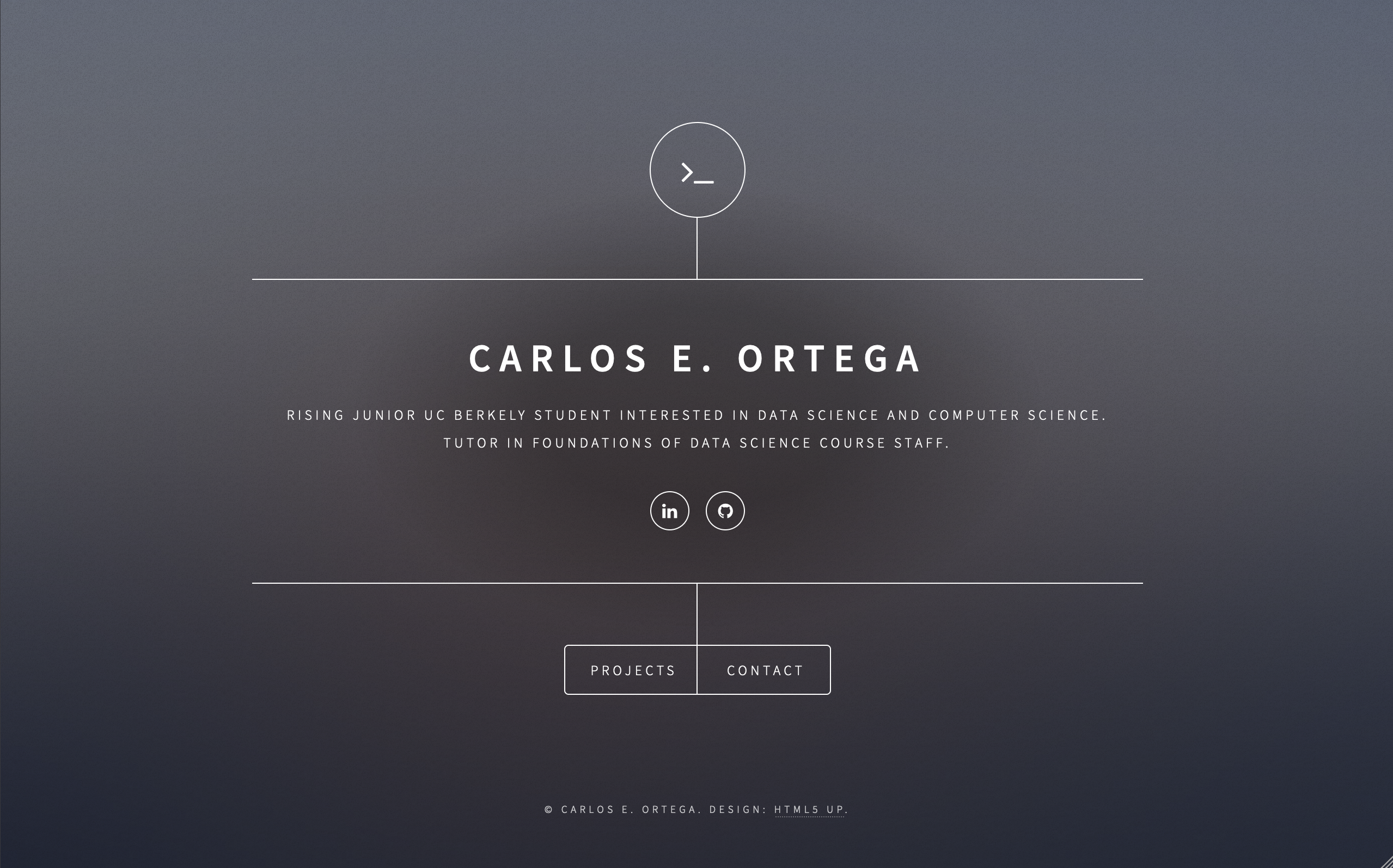
By September of that year, I had allowed my original domain, CarlosEOrtega.com, to expire and bought the domain I still use today, carlos.soy. With a new domain, I figured it was time for a new site, and an attempt to build it up from scratch. I knew it would not be as pretty as anything from HTML5 UP, but I wanted the experience.
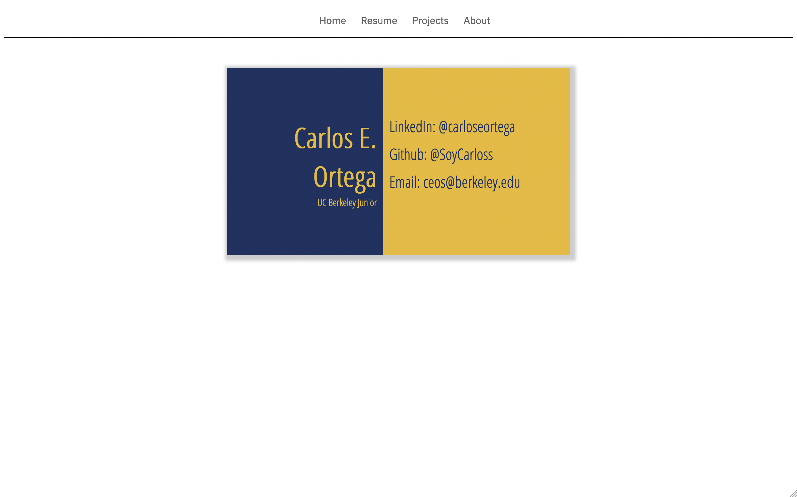

For some reason, I was obsessed with the idea of my homepage emulating a business card, which explains those design decisions. Besides that, there is not much to note. Yellow and Blue are some of my favorite colors, and it was fitting given that Blue and Gold were my school’s colors (Go Bears!).
This website was short-lived. I continued learning a bit more HTML + CSS, and by December I was uploading my new page. I had been reading about how much user drop-off there was in websites with multiple pages, so I decided to develop everything I wanted into a single web page.
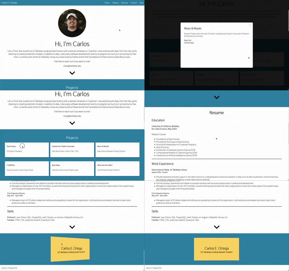
As you can see by the bottom of the page, I was still very much obsessed with virtual business card design. Just like my previous site, it was not as pretty as an HTML5 UP template, but I was learning a lot, so I was satisfied.
That design served me well, and I used it for over a year. Whenever I started/ended a new role, I would update the design. Honestly, the website design was fairly ugly, but it was the design I had when I landed my first internship, so I felt proud of it. It was not until New Year’s Eve of 2019 (unsure of why I decided to do it then), that I decided it was time to return to a professionally made design. This time, it was a template named Civic that I found on colorlib. It is still quite popular and if you do an internet search for “Civic - CV Resume” you’ll find a lot of sites using the theme that did not remove the title from some HTML tag.

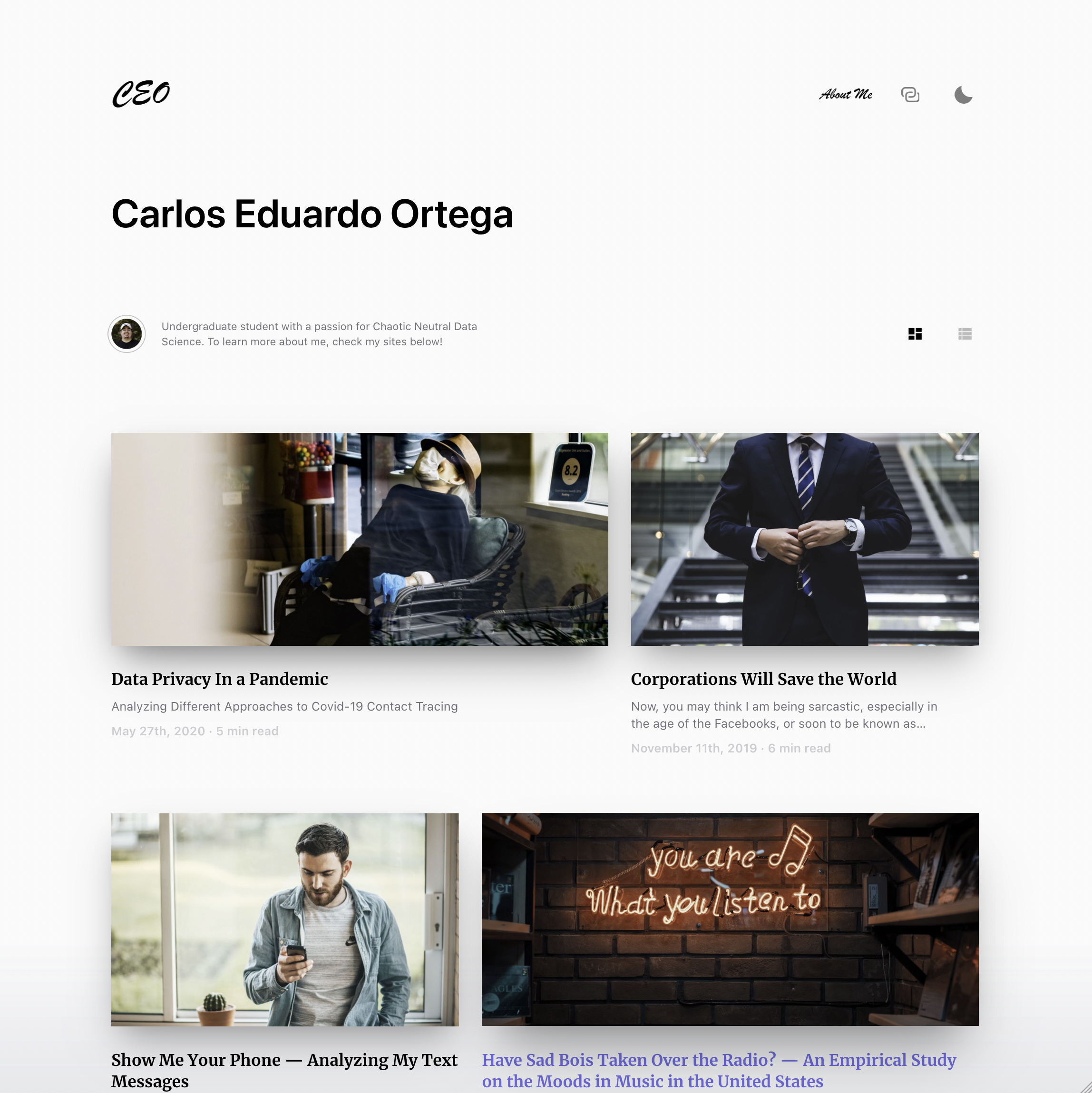
The website was beautiful, but extremely large. As you can see, whenever you scroll through there is not a lot of information on the screen at any one time. It was great for the 2+ years I used it, it helped me land jobs, but I started to feel the need for a different design. I also wanted to combine my website and blog. For most of this time, I had three different pieces of the puzzle: My website, my blog posts on Medium, and a Github Pages hosted blog with a Gatsby theme for archival.
The Ideation Phase
I knew that this time around I would need to build it from scratch again to get exactly what I wanted. But, before I could do that, I needed to figure out what I wanted. Luckily, I love scrolling through the websites and blogs of other tech folks, so I had been collecting inspiration for a while.
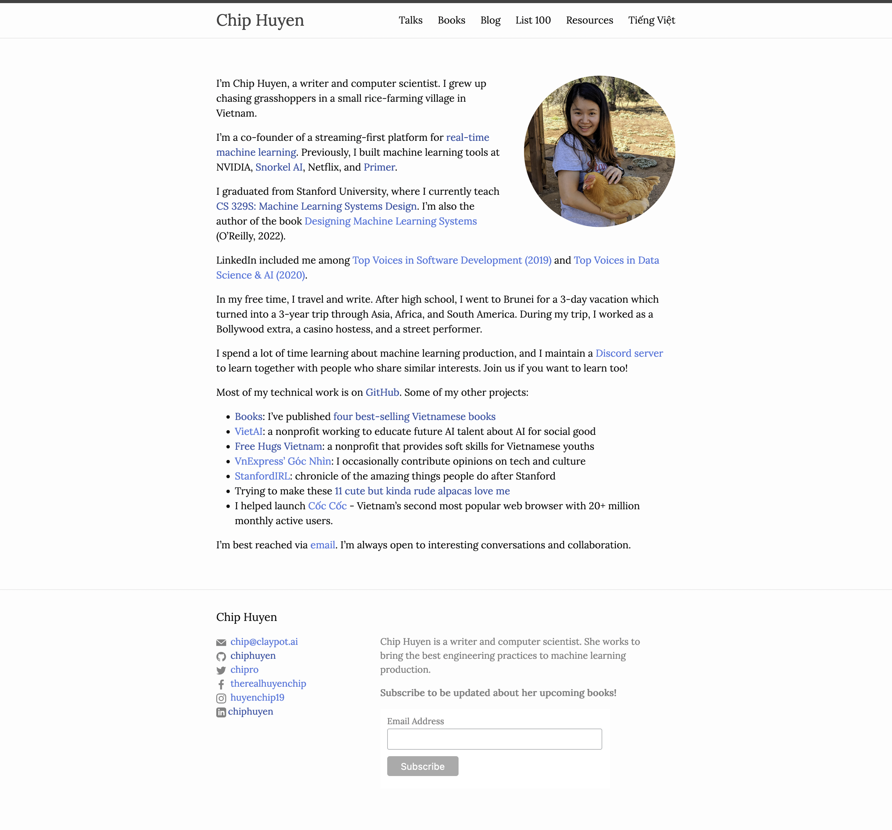
Chip Huyen’s site was probably my first source of inspiration. I loved how simple their home page and blog page were, as well as how the site does not take the full width of the browser on larger pages.
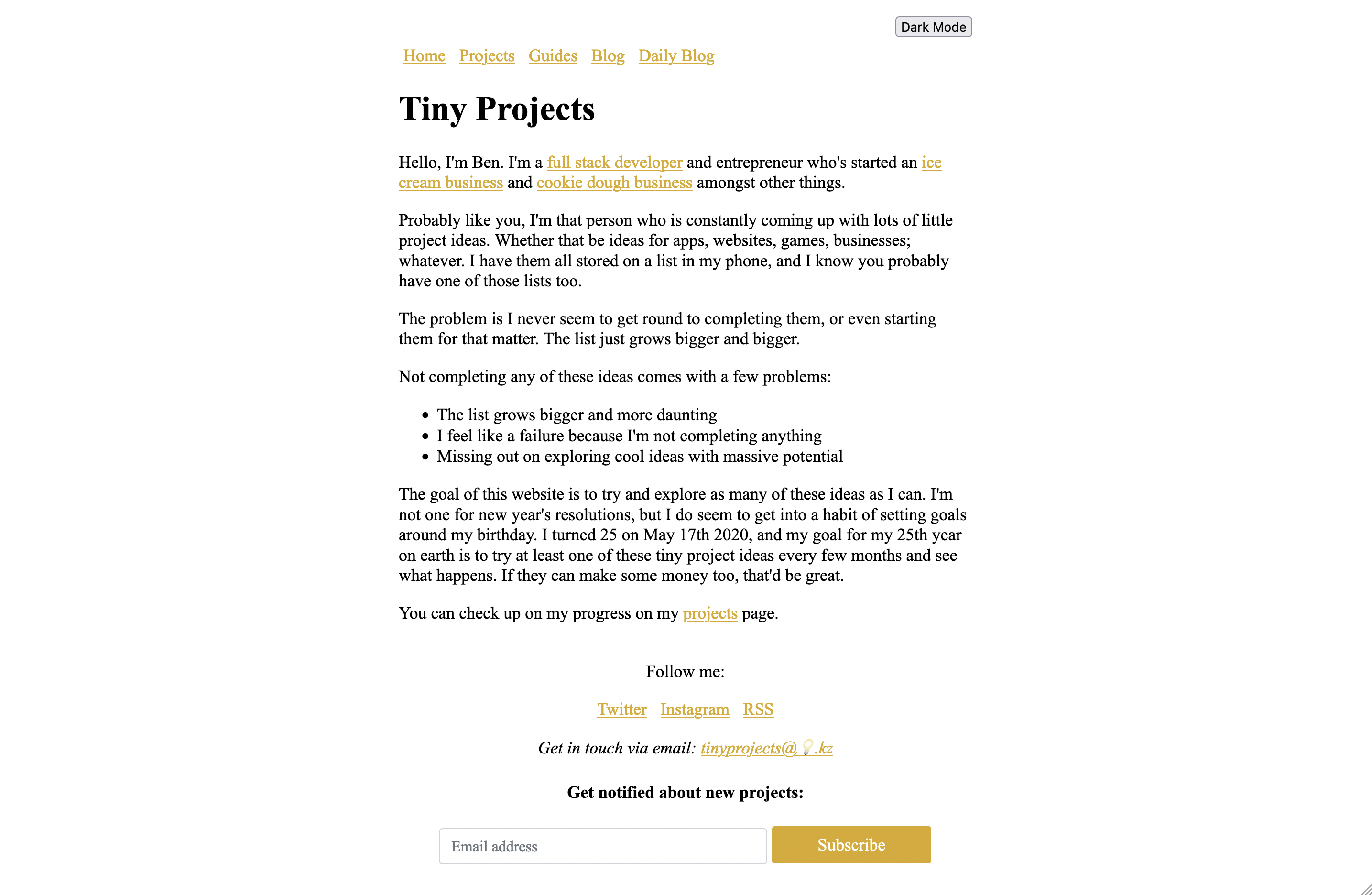
Ben Stoke’s Tiny Projects website was another source of inspiration. I found Tiny Projects from Issue #140 of the Hacker News Digest newsletter. You’ll notice there are a lot of design similarities between the Tiny Projects page and Huyen’s website. I was also attracted to the use of the yellowish-orange color and how they underline all pieces of text that have links.
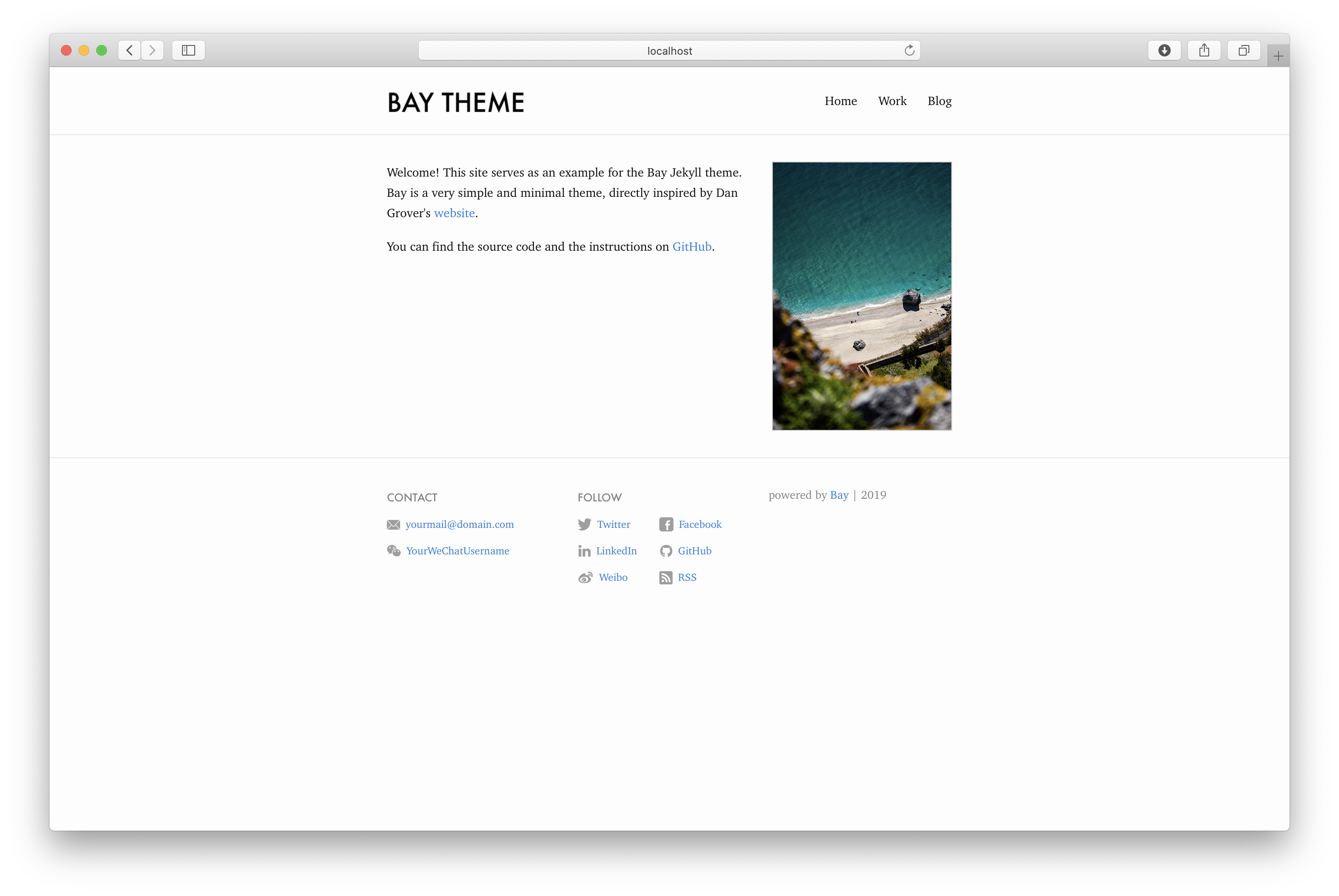
I found Elliot Vincent’s Bay Jekyll Theme as I was getting closer to finishing up the design of my new site. In this case, it inspired my navigation bar and the layout between the homepage hero image and its accompanying text.

The last piece of inspiration was for my resume page. Once again, this was something I found towards the end of my ideation phase. I loved Joel Glovier’s Jekyll Resume Template, so I took some pieces of inspiration from it. Although In my case, I decided to have less dividers, as well as the removal of some pieces of information I did not want to include in my own resume, like role or the executive summary.
The Development
In my own case, figuring out what I wanted the design to look like was the easy part. The hard part was figuring out how I wanted to develop it. I knew I wanted to build up from scratch, although the process felt borderline sadistic at times. So, I did what I always do. I opened up a new Notion page and laid out my wants:
- Easy/Efficient CSS
- Easy to update or add new blog posts
- Analytics
- A newsletter
- Comments for blog posts
CSS
I wanted the site to be lightweight, simple, but still pretty. Keeping all those things in mind, I did not want to spend too much time making it pretty. After all, the site is meant to showcase my work moving forward and it does not make sense to spend more time than needed when I can be using that time to work on new projects. That would be like the time in middle school I spent my only $20 on a new wallet, and then had no money to put inside.
So, I decided to use Tailwind. I had learned about it a month or so ago, and had already started using it for another project (Open Patterson). I had already found it quick to develop with. Plus, I loved the built-in support to purge unused CSS to ship smaller CSS files (although I have yet to set that up with this site).
Static Site Generator
Since I knew I wanted it to be easy to maintain, my first thought was to choose a static site generator. In the past, I had used Gatsby, but that was for an already existing theme, not to build one from scratch. After considering Gatsby, Hugo, and Jekyll, I ended up deciding on using Jekyll.It has been extremely popular for a long time, in part due to Github Page’s support of it. I love markdown files so that also made it a great fit. I also knew that in the future, I did want the Open Patterson site to be integrated with Jekyll, so using it on my own personal site first would make for a great experiment. I was not sure how to integrate Tailwind with Jekyll at first, but I luckily found a lot of great starter repositories. I ended up going with Stef Coetzee’s Jekyll + Tailwind Starter Repo.
Analytics
Now that I had decided on a CSS framework and Static Site Generator, I had to decide on the third-party services I would integrate. Weirdly enough, I found this part a lot harder than choosing frameworks. Given that I had decided I would now be posting all my blog posts, exclusively after this one, on my own website. I knew I had to integrate analytics. Before this, I did not know how many, if any people were visiting my site.
For my choice of website analytics, I ended up going with Microanalytics. I liked their primacy-first approach. If you go through their site, it is clear that privacy is central to the design of their service. On their front page they claim to be compliant with GDPR, PECR, and CCPA regulations. Given that Microanalytics is built and hosted in the European Union, I had some trust in their assurances to be GDPR compliant, and most likely in my home state's CCPA law.
It was especially important for me to find an EU built and hosted analytics provider due to a ruling from an Austrian judge earlier this year. In that ruling, from my understanding, they said that websites using Google Analytics was not GDPR-compliant because Google would transfer EU residents’ data onto U.S. servers, a country with weak data and privacy regulations. As far as I know, this ruling has had no impact with millions of websites in the EU still using Google Analytics. Although I do not know anyone from the EU, if the day comes that Google Analytics is officially blocked, I do not want my site to be geo-blocked from the EU, just because.
Plus, I knew from the beginning I wanted to avoid Google. I don’t want people’s data. I just want to know how many people are visiting my website, what pages, and from what country. Not their IP addresses or digital fingerprints.
Email Newsletters
My email newsletter provider decision was a lot easier. I was going to use MailerLite, but they required a physical address (because of laws outside of their control). When I was signing up, I found out ConvertKit provides a physical address their customers could use if they don’t have a alternative physical address. This was the only reason I switched last minute.
Comments
Now that I am moving away from Medium, I was trying to decide if I wanted to integrate a comment section. I initially planned to use Disqus, which is extremely popular, but after a bit of reading I found that it has a poor track record when it comes to privacy. Adding to this, the free version would be integrating trackers and ads into my site. This felt antithetical to the whole thought process I had when I decided to use Microanalytics as my website analytics provider.
So, I returned to the drawing board. I found a lot of great open source comment systems (Just Comments, Schnack, Talk, Discourse, Isso, Mouthful, etc). Discourse is a great tool I use in other communities, but it provides a more forum-like system, which is not what I am looking for. Some of the other options did not seem to be actively maintained, and the rest would require self-hosting. The whole reason I chose Jekyll was to make the site easy to maintain, and self-hosting a commenting system is adding more pain points.
Finally, I was deciding between two platforms: Commento and Lyket. Comment boasts privacy as a feature and implies it is GDPR-compliant by pointing out that Disqus is still not GDPR compliant. Lyket explicitly states it is privacy compliant. It also charges its paid tiers in Euros, so I assumed it was EU built, most likely GDPR compliant, and very likely CCPA compliant.
However, reading through both of their privacy policies, I found that both of these services store data in servers location in the United States. Which, If I understood the earlier ruling correctly, was one of the main issues the judge had with the use of Google Analytics. Alas, I am not a legal expert, and since EU businesses haven’t abandoned Google Analytics en masse, I figured I was safe with either of these services.
I ended up choosing Lyket. Not because it was cheaper (for 5k monthly page views) or for its free tier (500 monthly page views). I chose it because of its Medium-style buttons. They have Claps, Likes, and Dislikes. I considered using Likes, so that each individual could only react once, but I really love clap buttons. I imagine each one is an actual person clapping for me.
Actually, ignore that last paragraph. I misread the entire Lyket site. It turns out Lyket’s service is ONLY buttons, so I am using, both, Lyket and Commento. We’ll see in the long-run how it ends up going.
Lyket also had the option of integrating Google reCAPTCHA V3, but I think we already established my paranoia around integrating Google services. I’ve also read some concerning articles around reCAPTCHA V3 as compared to V2. With many comparing V3 to a tracking pixel as it asks to be on all web pages of a website to perform best, and only operates in the background. So, of course, I did not turn on this integration. I also disabled Lyket’s session ID, so that it would not store a unique browser session ID, given that I did not want my website to be storing cookies in visitors’ devices.
Given these decisions, I have very limited, or none really, bot detection for comments and claps. Hopefully, this does not become an issue. If it does, well, that will be future Carlos’ responsibility to fix.
And They Lived Happily Ever After
If you even reached the end of this post, I assume by scrolling past the entire thing, thanks for getting here. I did not realize how long this would end up being, but I really wanted to document my thought process for myself, and thought maybe someone else would enjoy it. Make sure to test out the comment and claps integration below, ya know, just for testing purposes. The site will continue to evolve with me, but I hope the decisions I made when developing it will make it easy to do so.
Also, thank you to my friend Ryan Salmasi for providing feedback.
