Introduction
It is often said that music is a reflection of the society at that time. Turning on the news on any given day often gives bleak news of a new epidemic, or a new study on the poor mental health of the public, or any other similarly gloomy subjects. At the same time, there has appeared to be a rise in sad music especially in the world of hip-hop. Giving fame to artists like Lil Uzi Vert, best known for “All My Friends are Dead” and Lil Peep who was known as a pioneer of emo rap. Both artists are known to be part of the emo hip-hop and rap subgenre. The sub-genre has been around since the 2000s but it is not until recently that is has started to become mainstream. I decided to look at the top charts in the United States over the decades to find out if the music in the U.S. has become increasingly emo.
Feel free to skip to the results section if you are only interested in the findings.
Getting the Data
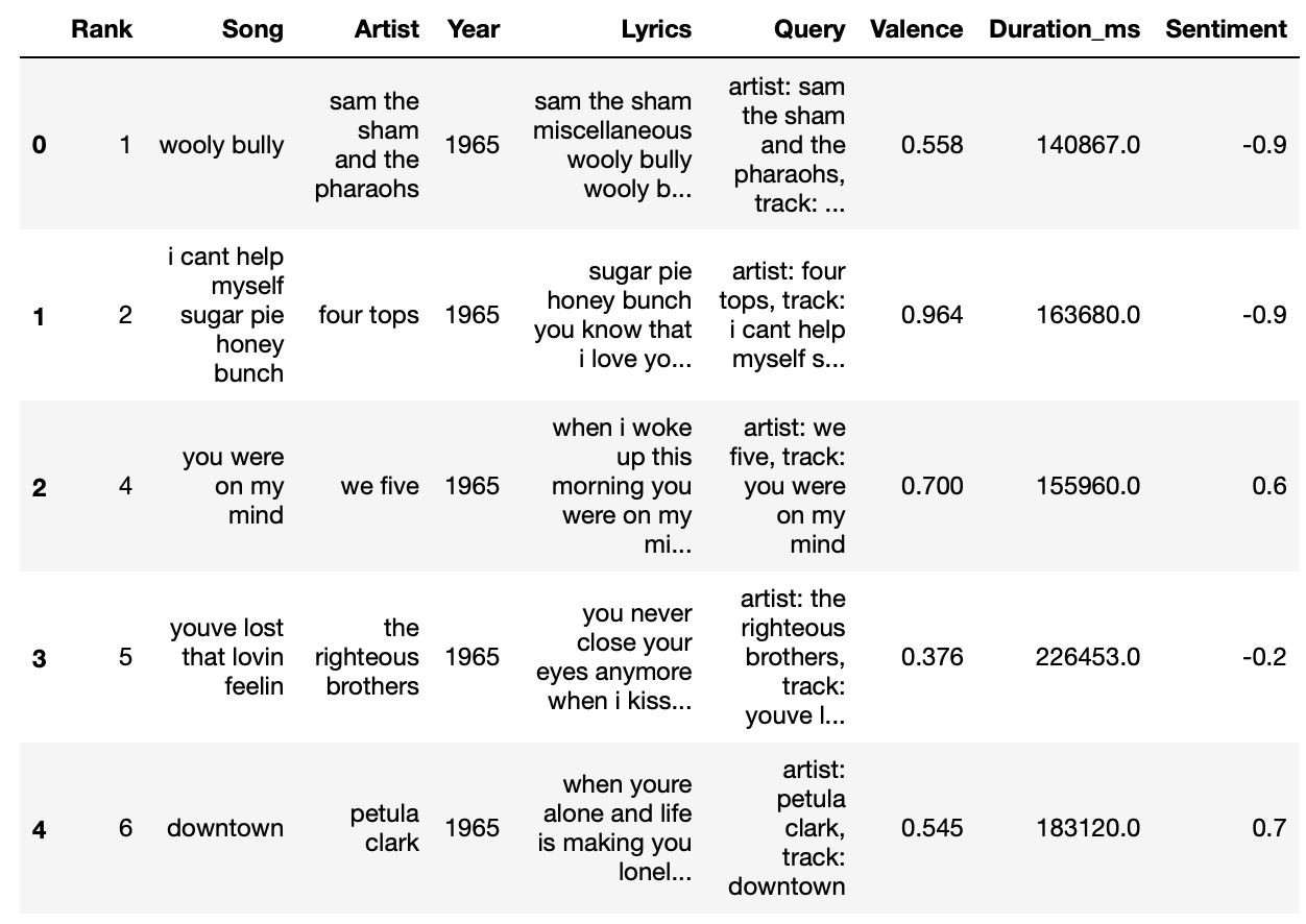
I started working with a dataset curated by @walkerkq on GitHub (https://github.com/walkerkq/musiclyrics). The dataset has the song name, artist, rank, lyrics, and the year it was on the Billboard Top 100 Charts for all songs in the Billboard Top 100 Charts from 1965 to 2015. I used Pandas to read the csv file into a Python notebook. I added a column, ‘Query’ which I would use when working with Spotify’s API afterward.

Then, I used Spotipy, a lightweight Python library to interact with the Spotify API, to find the valence and duration of each song through Spotify’s database. Of the original 5,100 song entries, I dropped the songs that did not contain the lyrics, the valence, or the duration. This resulted in 232 dropped songs or a total of 4,868 songs.

Working with the Data
In an effort or lack thereof, to avoid trying to reinvent the wheel I decided to use Google’s Cloud Natural Language API to perform the sentiment analysis on all the lyrics. The Cloud Natural Language API comes with a couple of caveats. For one, the Cloud Natural Language API sentiment analysis tool currently only works with English, Spanish and Japanese. Additionally, because some songs in the dataset may have corrupted lyrics or no lyrics at all due to the way it was scraped, the API was not able to analyze these songs. Dropping these songs resulted in the final table only having 4073 songs. For the most part, each year had around the same number of songs, with some difference between 1965–2000 and 2000–2015.
Once I had the sentiment value given by Google’s API, which is between -1 being negative and 1 being positive, I used RCharlie’s gloom index formula, which is linked at the end of this post, to take into account lyrical density, or the number of words over the duration of the song, the sentiment analysis given by the Natural Cloud API, and the valence given by Spotify’s API.

For the final calculation, I normalized all the gloom index values to be between -1 and 1.

The Results
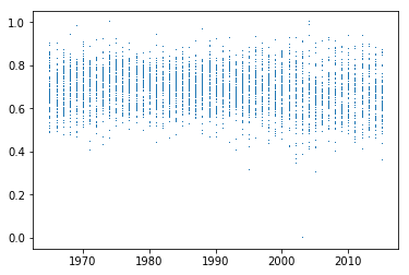
The first visualization I made was a scatter plot of all the songs by year and their corresponding gloom index.
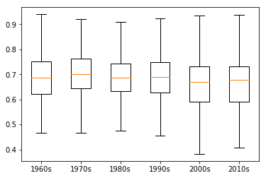
As you can see, this does not show us much. However, once I made the box plot of all the songs by decade, it starts to look a bit more interesting.

The averages of each decade, noted by the yellow line, appears to not change too much over this timespan. However, more current decades display a much wider range with minimums reaching as low as -5 while the high remains the same. As time goes on, the emotion displayed in popular music appears to be more polarizing because of its larger spread.
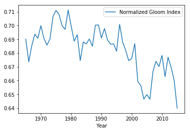
Finally, I made a line plot of all the years and the average gloom index per year to see a clearer picture of what is going on.

As seen in the graph, on average songs overall have been getting sadder. With the lowest value occurring in 2015. For our final graph, we plotted these same points on a scatter plot and plotted a least squares polynomial fit line with a degree of 3 over it.

Conclusion
The overall trend appears to be that music, on average, is becoming sadder or more negative, but it still leans towards the positive end. There is no doubt that this is due to a multitude of factors such as, world events, the economy, and living conditions among other things, which would require analysis outside of my expertise. Although I cannot prove causality, I took the liberty of plotting the average gloom index value per year alongside some arbitrarily chosen key events in modern U.S. history.

We do not know how impactful if at all, these events were in the mood of music at that time. However, the data does defend the idea that mainstream music has become sadder and more polarizing in emotion. Whether or not music like Lil Peep’s and Lil Uzi Vert continues to be the music of choice will be up to the public. Time will tell if the U.S. will go back to the positive music displayed in the 70s.
Credits
I’d like to give credit to RCharlie. This project was largely inspired by him and his ‘fitteR happieR’ article (https://www.rcharlie.com/post/fitter-happier/) where he set out to find which Radiohead album was the saddest.
I’d also like to thank Oscar Syu and the rest of the Research and Publications Committee at UC Berkeley’s Statistics Undergraduate Student Association for giving me the resources and support to complete this project.
